Owning the dashboard, not renting it.
A bespoke, tiered dashboard system for Brambles' Supply Chain Illumination platform, so both account managers and enterprise customers like Walmart, Costco and Tesco could build their own. Designed and built in a few weeks using an AI-accelerated, design-system-first workflow.
Project snapshot
A short, contract-deadline-driven build that had to replace a costly third-party product without losing any of the customisation the business had already promised to its current and new customers.
The challenge, in short
Brambles' customer dashboards were split across Power BI and Brix, a third-party system whose fee had grown too high to justify. Rather than just replace it cheaper, the real opportunity was to build a dashboard experience customers could shape themselves, our data, our frontend, tiered by subscription, in the few weeks before the vendor contract renewed.
The opportunity wasn't a cheaper dashboard. It was a dashboard our customers could actually build themselves.
My role, in short
I led product design on the customisable dashboard system for SCI, working with a cross-functional team and bringing in a Senior UX Designer to co-create the data-visualisation components. Tap a tile for the fuller picture.
What I worked on
Design System Foundation
Built as a reusable block library so a dashboard could be assembled from existing parts in minutes, rather than designed screen by screen.
Dashboard Flows
Designed how a customer actually builds a dashboard from those blocks — creating one, editing it, tailoring it to what their team needs to see.
Tiered Permissions
Decided what a given customer could actually build based on their subscription level — a commercial constraint that had to be designed for, not just the visuals.
Data Visualisation
Brought a Senior UX Designer on as a close collaborator specifically for the chart and data-viz components, working the deadline together rather than splitting it into a handoff.
The team
Lead DesignerMark Jones
Design-system foundation, dashboard flows and the tier-based permission logic, designed and driven personally.
Senior UX Designer
One of the strongest designers I’ve worked with — we built the chart and data-viz pieces together as true collaborators, not a design lead reviewing someone else’s work.
Product Owner
Balanced what the tiered product needed to support against what was realistic to ship.
Lead Engineer
Partnered closely throughout, not brought in only once the design was finished.
Researcher
Fed findings directly into the component and flow design rather than a separate synthesis phase.
Implementation & customer-facing teams
From office-based teams to people on the factory floor — direct input into what the dashboard needed to surface, not assumptions from a desk.
Impact, in short
Dashboards that used to take up to six hours to build now take minutes. The frontend is Brambles' own, on Brambles' own data, no longer dependent on a third-party supplier's pricing, and the component library it's built from has since been adopted into Brambles' official design system as full patterns and reused by 3+ other Brambles products. Templates, editing rights and the block library now scale by subscription tier, and two audiences, internal account managers and customers themselves, build dashboards from the same system today.
Try the dashboards yourself.
The dashboards in this case study moved from sketches and flows into my AI Playground as working, chart-driven prototypes. This is the Playground, running, and it opens on the Dashboards section, so you can open a dashboard, work the filters and see the chart components and tokens behave as one system.
Work in progress. The overview, dashboards, campaigns and administration areas are open; other sections show as coming soon. Built from the Playground’s own design-system components by directing Claude Code and OpenAI Codex in VS Code, with GitHub Copilot inline, on fictional data throughout.
This is the Playground itself, running.
Not a screenshot or a recording. It’s gated while it keeps evolving; if you’d like to try it, ask me for the password.
Don’t have the password? Email me or message me on WhatsApp and I’ll send it over.
The challenge
Brambles' customer-facing dashboards were built two ways, and neither one belonged to us. Some lived in Power BI, functional but never quite fitting how SCI customers actually worked. The rest ran on Brix, an internal dashboard system built on a third-party supplier's backend, and that supplier's fee had grown to the point the business was no longer willing to pay it.
That's a familiar shape of problem: a capability the business depends on, sitting on a vendor relationship that's stopped making commercial sense. The genuine opportunity wasn't just "build it cheaper." It was to use the vendor contract's renewal window as the moment to build a dashboard experience customers could actually shape themselves, our data, our frontend, tiered by subscription, rather than one fixed product handed down from a supplier.
Before that rebuild could start, there was a shorter, narrower job to do first: white-labelling the existing Brix dashboards into SCI's own look and feel, so customers experienced one consistent product while the real system was being built behind the scenes. I steered that transition, keeping it fast and visually consistent with SCI, precisely so it wouldn't need to be a story of its own. It bought the time the real build needed.
The opportunity wasn't a cheaper dashboard. It was a dashboard our customers could actually build themselves.
My role
I led product design on the customisable dashboard system for SCI, working across UX, research, implementation and customer-facing teams, and directly with engineering, to take it from building blocks to a shipped, tiered product.
That covered the design-system foundation the whole build sits on: the chart, table and metric components dashboards are assembled from, the flows for creating, editing and customising a dashboard, and the functionality that decides what a given customer is actually allowed to build, based on their subscription tier. With the deadline tight, I brought in a Senior UX Designer, one of the strongest designers I've worked with, onto the data-visualisation components as a close collaborator rather than a hand-off; we co-created that piece together, and worked closely with implementation and customer-facing teams to validate what users on the ground, in the office and on the factory floor, actually needed a dashboard to tell them at a glance.
Contributions
A genuine team effort, with one close collaboration worth calling out. Here’s the honest breakdown — tap a tile for the fuller picture.
What I worked on
Design System Foundation
Built as a reusable block library so a dashboard could be assembled from existing parts in minutes, rather than designed screen by screen.
Dashboard Flows
Designed how a customer actually builds a dashboard from those blocks — creating one, editing it, tailoring it to what their team needs to see.
Tiered Permissions
Decided what a given customer could actually build based on their subscription level — a commercial constraint that had to be designed for, not just the visuals.
Data Visualisation
Brought a Senior UX Designer on as a close collaborator specifically for the chart and data-viz components, working the deadline together rather than splitting it into a handoff.
The team
Lead DesignerMark Jones
Design-system foundation, dashboard flows and the tier-based permission logic, designed and driven personally.
Senior UX Designer
One of the strongest designers I’ve worked with — we built the chart and data-viz pieces together as true collaborators, not a design lead reviewing someone else’s work.
Product Owner
Balanced what the tiered product needed to support against what was realistic to ship.
Lead Engineer
Partnered closely throughout, not brought in only once the design was finished.
Researcher
Fed findings directly into the component and flow design rather than a separate synthesis phase.
Implementation & customer-facing teams
From office-based teams to people on the factory floor — direct input into what the dashboard needed to surface, not assumptions from a desk.
Building blocks first
Before a single dashboard could be designed, the pieces it would be built from needed to exist, and be trustworthy enough that anyone assembling a page from them didn't have to think twice.
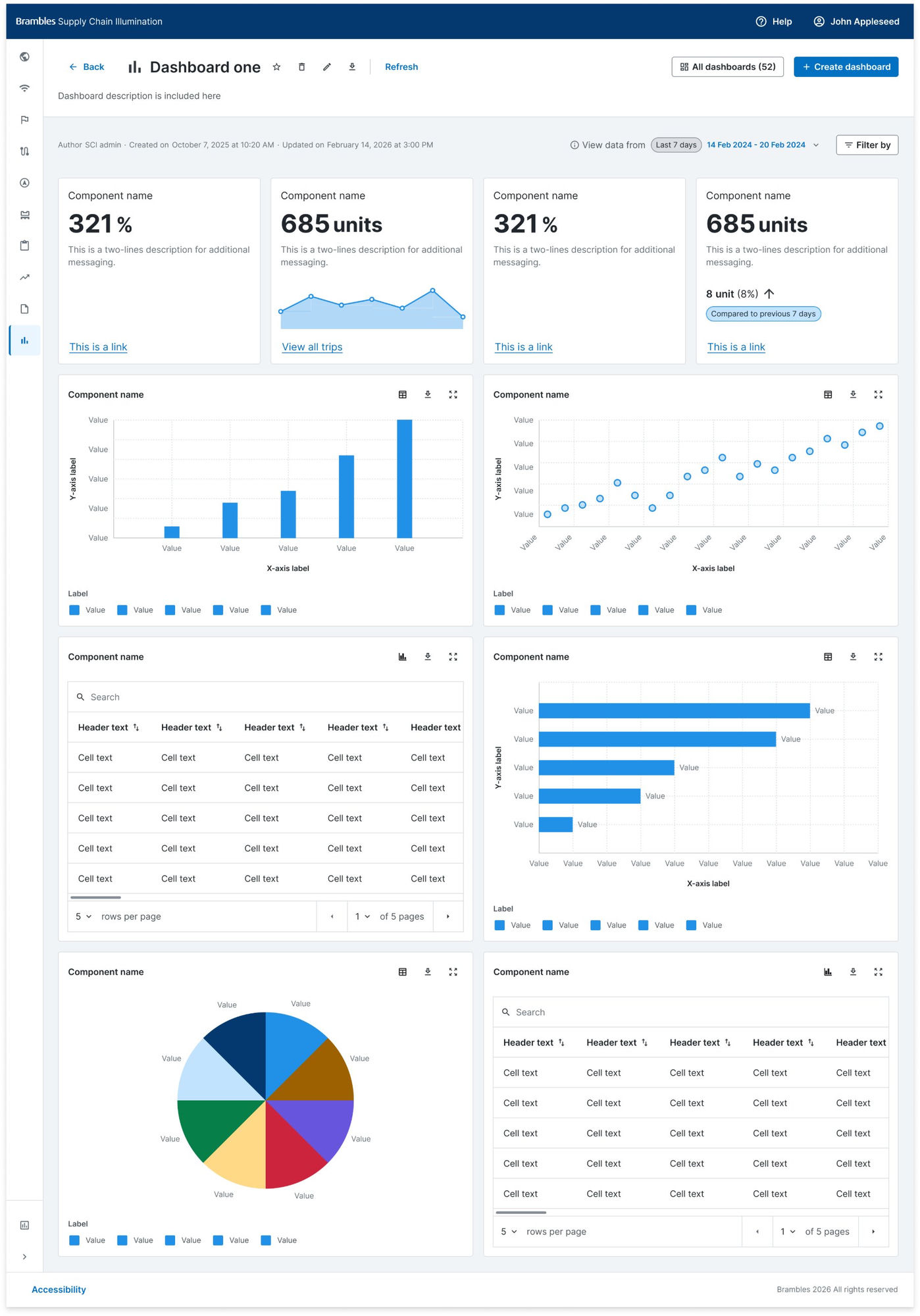
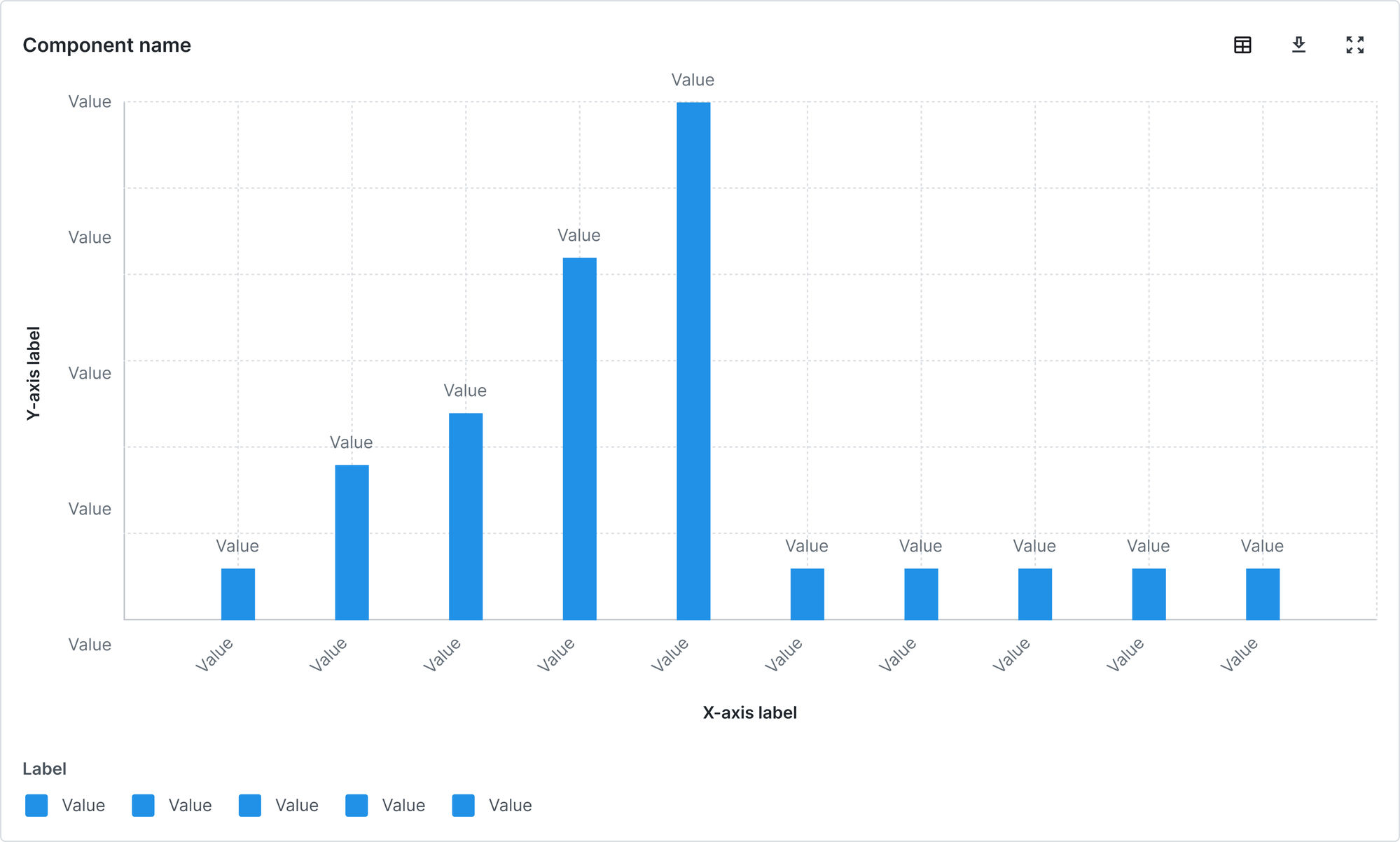
Every SCI dashboard, whichever tier or audience it's built for, is assembled from the same underlying set of components: chart blocks, table blocks and metric blocks, each with its own set of variations for the type of data and the level of urgency behind it. A supply chain lead scanning for a problem needs a different read than someone building a monthly performance summary for a customer meeting, so the block library had to support both without becoming two separate systems.
This is where I leaned hardest on AI-assisted tooling, not to replace the design thinking, but to accelerate the sheer volume of variation a real component library needs. Given the deadline, I brought in a Senior UX Designer to co-create the data-visualisation components with me, and together we used AI-assisted tooling to build out the chart, table and metric blocks in Figma, so a small team could produce a genuinely wide set of building blocks, and their states, in the time a contract deadline actually allowed.
Table and metric blocks followed the same logic: one component, several densities and states, rather than a bespoke table built per screen. A metric tile that shows a single number needs to behave the same whether it's reporting on-time delivery for one location or an entire flow, so the states, good, at-risk, breached, were designed once and reused everywhere a number needed to carry a verdict, not just a value.
None of this was building components for their own sake. Every block existed because implementation and customer-facing teams had validated a real user need behind it, working directly with the people actually building dashboards for Walmart, Costco and Tesco day to day, and with the archetypes on the other end of them: an office-based analyst with time to dig into a table, and someone on a factory floor who needs a single number to tell them, at a glance, whether to act.
Here's the library in full, every metric, table and chart variation, their sizes and their states, exactly as documented in Figma. Click it and use scroll or pinch to zoom in, drag to pan around.
A library of blocks is only useful once someone can actually assemble them into something a customer can use.
Flows and functionality
The building blocks only mattered if the flows around them, creating a dashboard, editing one, starting from a template, were fast enough for a non-technical account manager or customer to actually use.
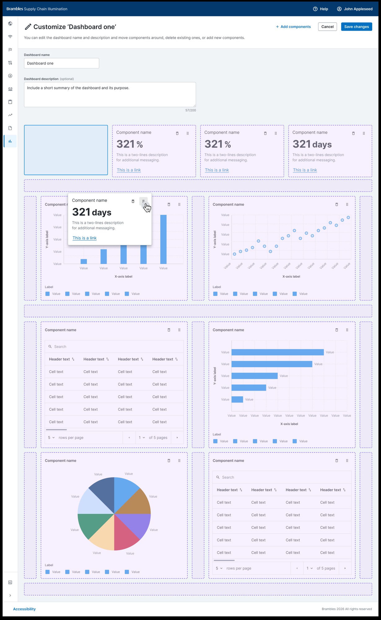
Customers weren't meant to start from nothing. Depending on their subscription tier, a customer could be handed a pre-built starting dashboard, then customise it, add a tile, remove one, swap a chart for a table, or build a new one entirely from the same block library. Internally, account managers had the same building capability, so a dashboard a customer needed urgently didn't have to wait on an engineering ticket.
Tiering wasn't bolted on afterwards. What a given customer could build, start from a template versus build from scratch, a limited block set versus the full library, was a first-class part of the flow design from the beginning, because it's what let the business offer a genuinely differentiated product at each subscription level rather than one dashboard experience gated behind a paywall.
Editing an existing dashboard followed the same building-block logic in reverse: select a tile, swap what it shows, resize it, or remove it, without ever leaving the dashboard itself for a separate configuration screen. That mattered more than it sounds. A customer mid-conversation with their own stakeholders needed to be able to reshape what they were looking at in the moment, not raise a request and wait.
Everything above is the summary. Below are the two full Figma flows behind it, every state, edge case and annotation, exactly as they were designed. Click either one and use scroll or pinch to zoom in, drag to pan around.
Designing the blocks and flows was only half the job. Getting them built, fast, and built right, was the other half.
Building it fast, and building it right
A few weeks to design and ship a whole dashboard system only works if design and engineering are moving at the same speed, so the same AI-assisted approach that accelerated the component library carried through into the build.
Once the Figma building blocks existed, product, UX and engineering worked from them directly, building the frontend in React, using Claude Code in VS Code to turn a documented component into working code fast: build me a page, add this tile, wire this flow. That workflow is what let the block library become an actual product in weeks rather than months, without the usual gap between what got designed and what got shipped.
That workflow got faster again once the Figma component library itself was synced into a matching code component library inside the same AI Playground. Every chart, table and metric block from Chapter 01 already existed as a named, documented pattern on both sides, design and code, so adding one to a dashboard page stopped being a small build task and became a single prompt: add a bar chart here, swap this tile for a metric card, add a table below it. The Playground isn't guessing what that component should look like. It's reading the same block the design system already defines.
The strength of that isn't that it removes engineering, it's that it removes the gap between a validated design-system component and a working page. A chart, table or metric-card tile that used to mean a small build ticket now takes seconds, and because every tile still comes from the same synced library rather than one-off code, that speed doesn't cost the consistency the parallel build in Chapter 04 nearly did. It's the same discipline as the rest of this build, applied one prompt at a time.
That speed cut both ways. It also meant it was possible to build something fast without the design system at all, and for a while, that's exactly what happened.
When speed loses the system
Partway through, a separate, AI-accelerated build started in parallel, outside the component library and outside the UX patterns already validated and shipped. It moved fast. It just didn't hold together.
Brambles was testing AI-accelerated development more broadly at the time, and one strand of that testing produced a second version of the dashboard build, built quickly with AI tooling, but built outside the design system and without the UX patterns already validated and in production. It's an easy mistake to make precisely because AI removes the friction that used to force a check-in: building a parallel system from scratch used to take long enough that someone would ask whether it should exist. With AI, it doesn't, so the divergence can ship before anyone catches it.
The result reached implementation teams as something that looked finished but wasn't usable. It's the clearest, most direct evidence I have that a system, however fast it lets you move, only earns its speed if what it produces is still coherent.
"This has taken far too long for me to build a custom dashboard. It's still not resolved, and it could take up to six hours to build a dashboard and still not be right. My customers couldn't see the vital information they'd asked for, and that put contracts at risk."
I pushed back on it directly, not to defend a design file for its own sake, but because a working, validated version already existed, and rebuilding around it from scratch was costing the business real time against a customer-facing deadline. I made the call to pull the parallel build back under the same system rather than let it keep drifting, brought the product owner, lead engineer and the Senior UX Designer back round the same table, and got the support signed off to close the gap fast without slipping the deadline it had put at risk. The fix wasn't to slow AI-assisted development down. It was to point it at the system that already worked.
Once the AI-accelerated build was pointed back at the design system, instead of around it, the same speed started producing the right thing.
Fast, and consistent, at the same time
The lesson wasn't "AI is risky." It was that AI needs the same design-system guardrails as any other accelerant, or the thing it accelerates is drift, not progress.
I led that realignment personally, getting involved directly in the AI-accelerated build itself rather than reviewing it after the fact, working alongside the product owner and lead engineer, and with the Senior UX Designer back on the data-visualisation components, to make sure it was working from the same component library, the same Figma blocks and the same validated UX patterns as everything else on SCI. That's the actual difference between AI as a shortcut around good process and AI as an accelerant for it: the same tooling, pointed at a system instead of around one, with someone accountable for making that call.
Once that realignment happened, the numbers the implementation team had been living with reversed. Dashboards that had taken up to six hours to build, and still weren't right, came down to minutes, because assembling a page from validated, documented components is a fundamentally faster job than reverse-engineering a UX pattern from scratch every time, AI-assisted or not.
"We're building dashboards in minutes now. We can duplicate them, customise them, edit them, and the whole experience is so much more responsive and easier to digest. It's cleaner in terms of content, information architecture and the actual look and feel. It just feels more on brand and more relevant, and it's such a dream to use compared to where we started."
The component library didn't stay inside this one project either. Three more Brambles products have since adopted the same dashboard components and the same customisation UX to build their own dashboards, and the library itself has been folded into Brambles' official design system, not as a handful of atomic components like buttons and inputs, but as full patterns: the chart, table and metric blocks, and the flows for assembling, editing and customising a dashboard, that other teams can now build features from directly rather than design from scratch.
A system only proves itself once the people building on top of it would rather use it than work around it.
Where this system stands today
A dashboard experience Brambles owns outright, built from a shared component library, fast enough for the people who actually build dashboards to reach for it first.
Where this sits in the business. Brambles reports a 16-point rise in its net promoter score against its FY21 baseline, customer orders through digital channels ahead of its FY25 scorecard target, and a stated push to combine “data, AI and insights from our digital assets” across the network. Those are group-level results with many contributors; the dashboards here are one of the places customers meet that data. What I can claim is the part above: minutes instead of hours, a frontend Brambles owns, and a component library three other products now build on.
Sources: Brambles FY25 and FY26 results announcements, August 2025 and August 2026.
What this demonstrates
A dashboard is never just a chart. It's the difference between a factory-floor supervisor reacting in seconds and an account manager spending an evening explaining to a customer why the number on screen doesn't match what they were told.
Speed without a system just moves the problem faster. The system is what makes the speed worth having.
This was building the blocks before the screens, validating them with the people actually building dashboards for customers like Walmart, Costco and Tesco, using AI to accelerate that library honestly rather than around it, and staying close enough to a parallel AI-accelerated effort to pull it back to the same system when it started to drift. The result is a dashboard experience the business owns, that both its own teams and its customers can build from, in minutes rather than hours.
Try the dashboards yourself.
The dashboards in this case study moved from sketches and flows into my AI Playground as working, chart-driven prototypes. This is the Playground, running, and it opens on the Dashboards section, so you can open a dashboard, work the filters and see the chart components and tokens behave as one system.
Work in progress. The overview, dashboards, campaigns and administration areas are open; other sections show as coming soon. Built from the Playground’s own design-system components by directing Claude Code and OpenAI Codex in VS Code, with GitHub Copilot inline, on fictional data throughout.
This is the Playground itself, running.
Not a screenshot or a recording. It’s gated while it keeps evolving; if you’d like to try it, ask me for the password.
Don’t have the password? Email me or message me on WhatsApp and I’ll send it over.
See the same discipline applied at a different scale.