Turning flight search into a trusted decision.
A UK travel-sector first that replaced guesswork with evidence at the exact moment customers were choosing a flight — built with Routehappy, and winner of two industry awards.
Project snapshot
My role
I led UX on Flight Facts end to end, from framing the discovery through to launch and post-launch optimisation.
I planned and ran the user research, designed the site experience, and owned testing and optimisation — in the lab through prototyping and eye-tracking, then live through A/B and MVT experimentation. It was very much a team effort across product, brand and development, but as UX lead I was the decisive voice in the stakeholder group that unpicked which concept — among several competing ideas — would actually differentiate us from competitors: Flight Facts.
The problem was hiding in the call centre.
Netflights.com operated in a competitive, commoditised market against Expedia, Opodo and Thomson. We needed a genuine point of difference — and the data told us exactly where to find it.
Customers were searching flights 39,000 times a day on Netflights.com, but a steady stream of them were picking up the phone anyway. Our answer rate had slipped from 92% to 89.6%, and a quarter of all inbound calls had nothing to do with booking — they were customers asking questions the website itself couldn’t answer: which flight had the extra legroom, which one served a proper meal, which one actually let you watch something on the way.
Servicing those calls cost roughly £15k a year, but the real cost was bigger: every customer who rang to ask a question was a customer we might lose to a rival with a shorter hold queue.
Customers weren’t confused about where to fly. They were unsure which flight to trust.
Growth in call volume outpaced the contact centre’s capacity to answer, so the rate slipped from 92% to 89.6% even as the team worked the same queries — a sign the problem was upstream, in what the website itself wasn’t telling customers.
Reframing what “choosing a flight” meant.
After three years of double-digit growth, we started to ask ourselves — what next? How could we continue to build on our successes and improve further?
Our vision, as presented to stakeholders at the time.
Evolve customer understanding
Five renewed personas across the customer base, each anchored to a real attitude towards booking a holiday.

“I want a great holiday for my family, and I’ll put in the hard work to make sure we get the best deal and best time away.”

“Now the kids have left home we have more time and enough money to enjoy ourselves. We’ll spend what we need to to get the best quality experience.”

“Work to live, don’t live to work! Me and my friends want to experience the world. We don’t mind what we have to do to get there as long as it’s cheap.”

“We work hard and play hard! It would be good to get away somewhere special this year…”
New
“Now I’m back at work we have less time, but more money. At the weekend, it’s nice to sit down with Mark and have a takeaway and a bottle of wine…”
NewCustomer learning — the funnel
We refreshed our customer personas and mapped the full journey funnel — from discovery (“I want to go on holiday”), through information (“I want to go to New York”), to purchase (“I want to buy my holiday to New York”). The gap we kept landing on sat in the information stage: customers had picked a destination, but not yet a flight, and price alone wasn’t enough to decide with confidence.
funnel
funnel
Early thinking treated the lower funnel — the moment of purchase — as the whole opportunity. Widening the lens to the middle funnel, where customers were still comparing flights, is what led us to flight attributes.
Future ideas, proof of concept.
Several concepts were scoped against that gap — a cached-journey tool, social search, an inspiration tool, and rich flight attributes. As UX lead, I was decisive in the stakeholder group unpicking which of those competing concepts would actually differentiate us from Expedia, Opodo and Thomson, rather than just add another feature. Flight attributes won: trip duration, meal service, seat and amenities, baggage — highlighting what mattered beyond price, to help customers choose the most suitable flight, not just the cheapest.
 Cached journey?
 Social search?
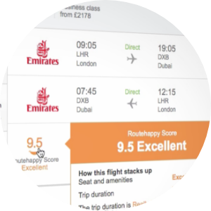 Flight facts?
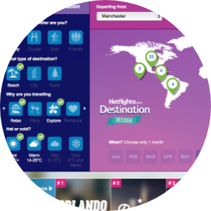 Inspiration tool?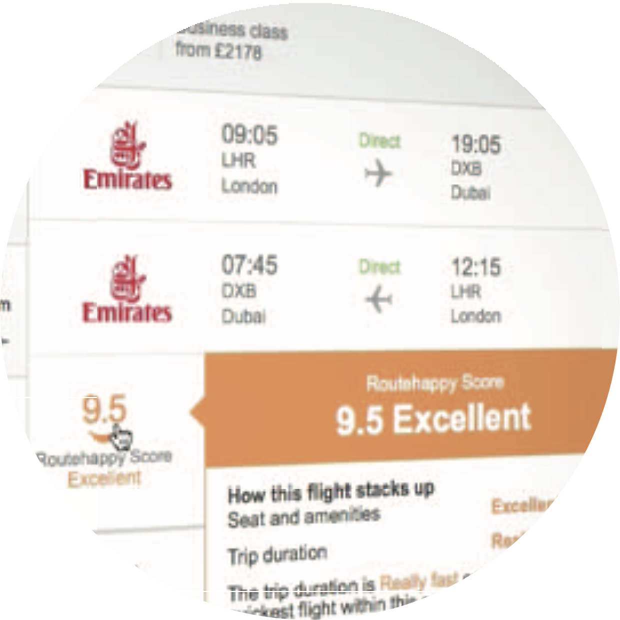
Concept scoping
To help customers choose — not just the cheapest — but the most suitable flight.
The information customers needed wasn’t missing. It just wasn’t on the website yet.
Building trust into the search results.
We partnered with Routehappy to license flight-attribute data at scale, then spent the design process finding out how much of it customers could actually use.
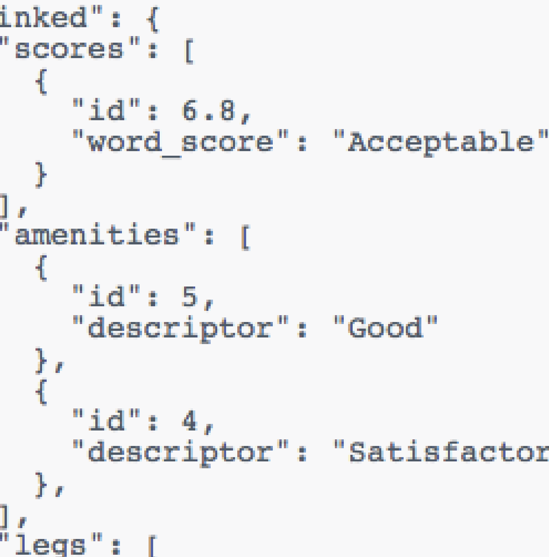
Building our own database of amenity data across every airline, aircraft and route was considered and ruled out — the scale was enormous, and accuracy would degrade the moment it went stale. Routehappy already maintained that data and scored each flight out of ten, factoring in comfort, speed and quality alongside price. We integrated their scoring with our own systems and branded the result Flight Facts.
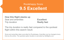
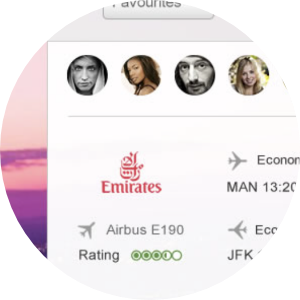
The Routehappy score, broken down into the reasoning behind it — not just a number.
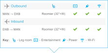
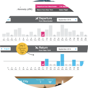
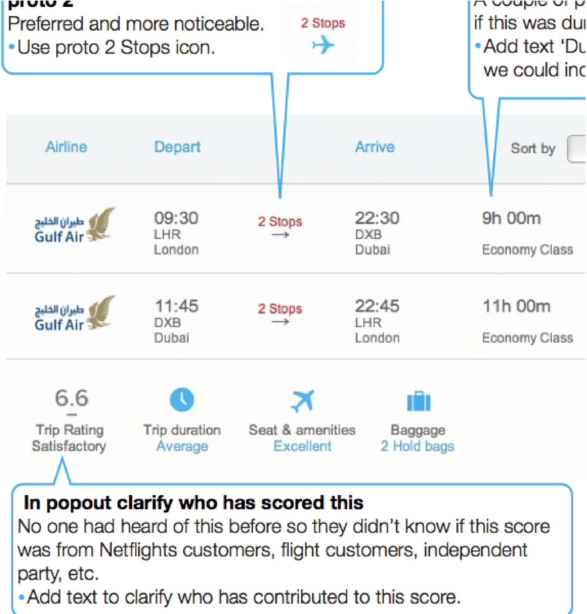
Flight attributes shown per leg, with a quick-reference key for what each icon means.
Three working prototypes (A, B and C) were built and usability-tested with card sorting and eye-tracking. Card sorting told us the priority order of what customers actually wanted to see first — for tall passengers, legroom outranked everything except price. Eye-tracking confirmed the score was noticed without distracting from the core buying decision: price, airline, and flight time still came first.
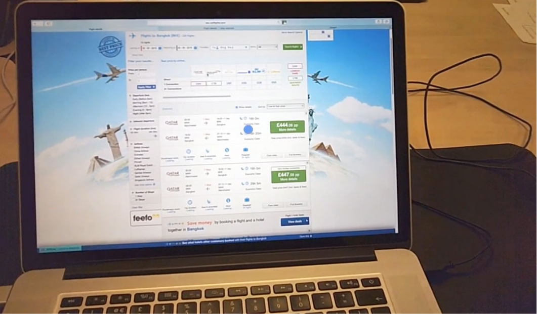
In the usability lab, running eye-tracking over live search results.
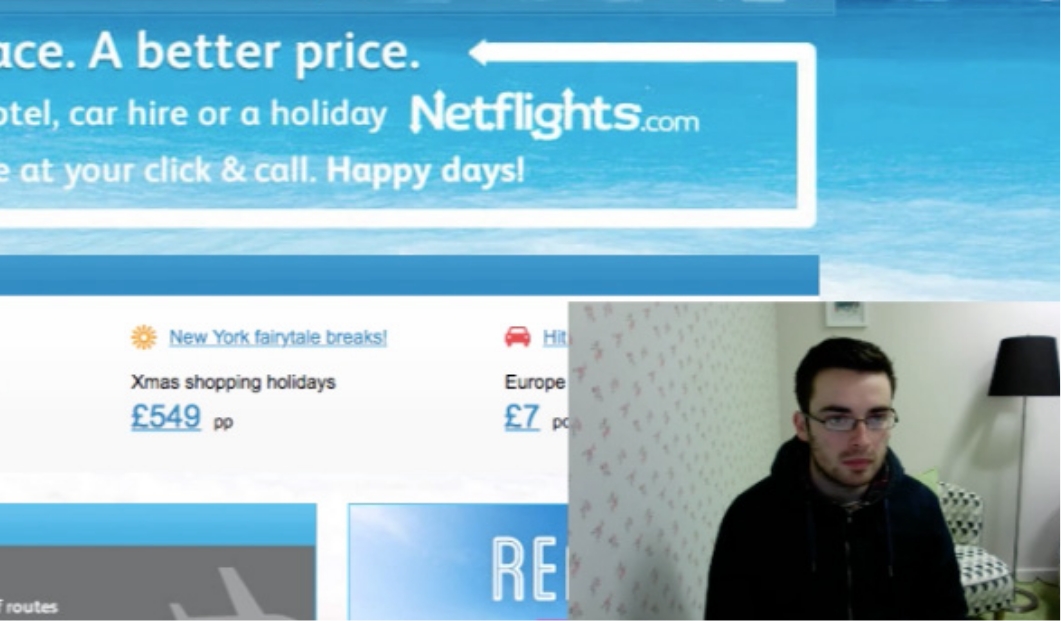
A participant talking through their choices, session recorded for review.
The prototypes tested 50% better than the existing Netflights.com site. The clearest late finding was visual, not structural: a traffic-light colour system on the score made the right choice obvious at a glance, and reinforced to customers that they’d picked well.
Routehappy’s own research made the case for why this mattered: at the time, only 38% of US domestic flights had Wi-Fi (a further 9% mid-rollout), and just 13% of regular economy seats offered genuine extra room, while premium legroom options had grown to 40% of domestic flights. Amenity data varied hugely between flights that looked identical on price alone — exactly the decision-critical detail Flight Facts surfaced at the point of search.
Search results scoring. The Routehappy score and amenity breakdown, live on a flight result.
Mobile comparison. Scoring carried the same weight comparing flights on mobile.
The loop that got it there.
Twelve stages, run as one continuous agile process from first sketch to post-launch optimisation.
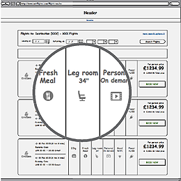 01VisionSketching the idea alongside key stakeholders.
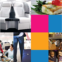 02UX & designA new user journey incorporating rich flight content.
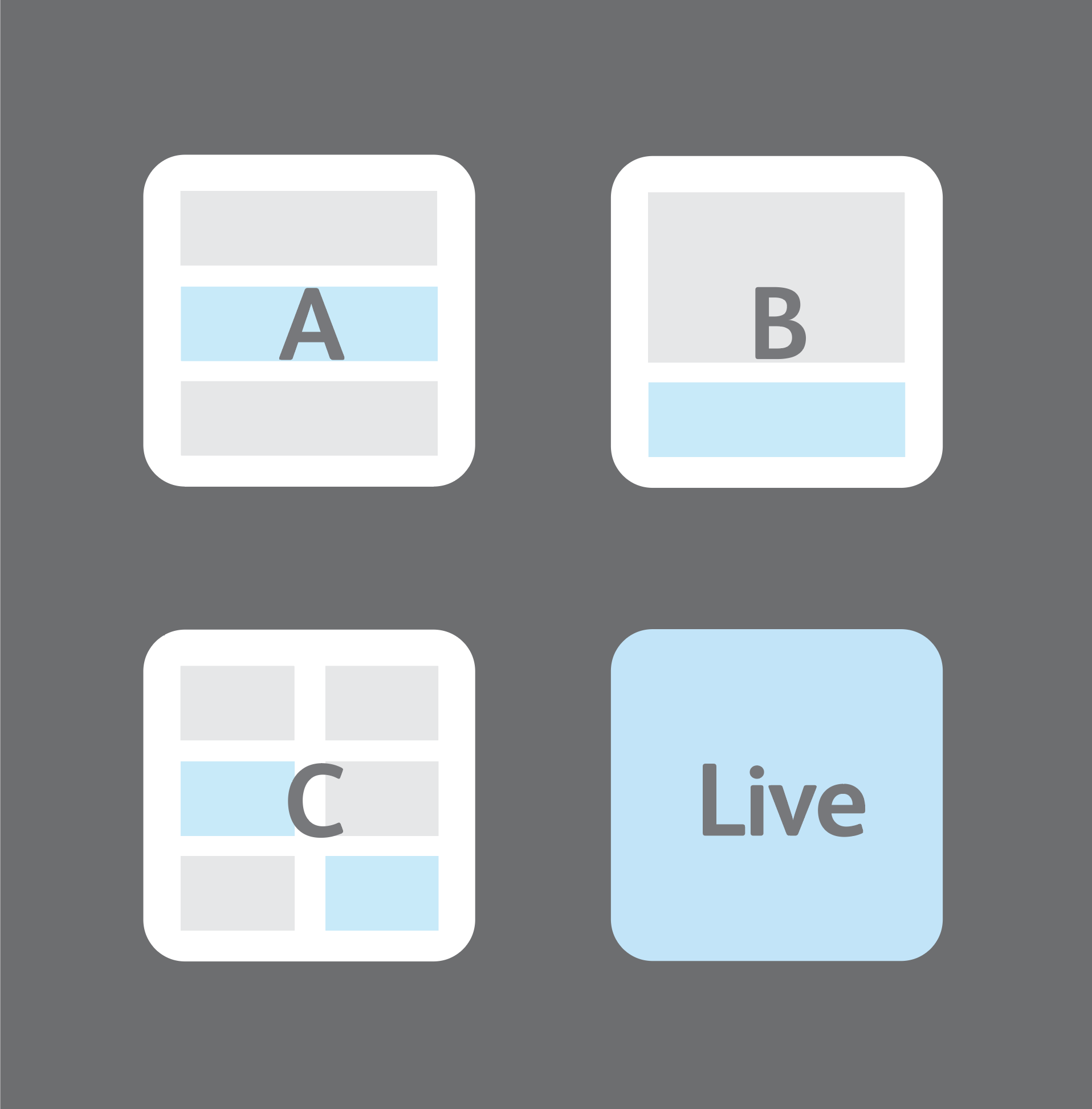 03High-fidelity prototypingThree working prototypes built, ready to test alongside the live site.
 04User studyFeedback taken and integrated straight back into the designs.
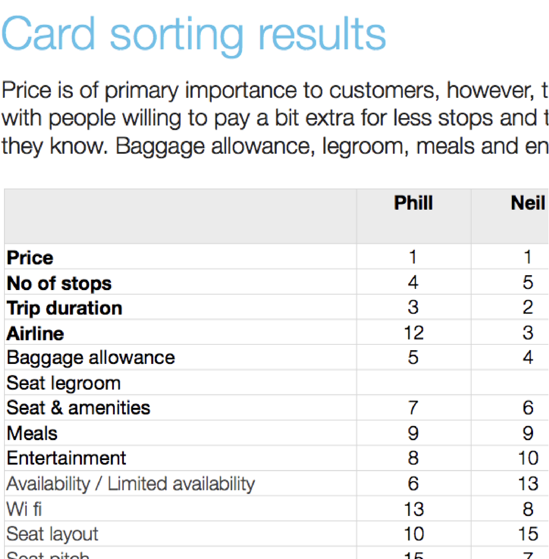 05Card sortingUsers prioritised which content mattered most when selecting a flight.
 06Content sourcingA reliable, up-to-date data partner identified: Routehappy.
 07DevelopmentFinal design tweaked based on feedback; build begins.
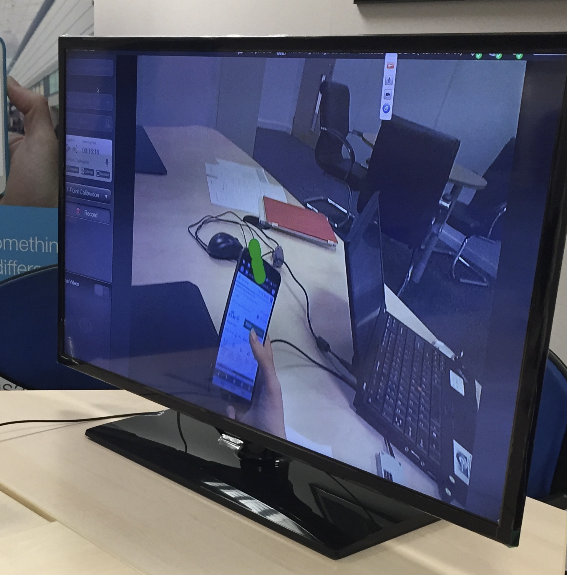 08Pre-launch studyEye-tracking on QA builds, understanding subtle user behaviour.
 09Final developmentChanges made based on user recommendations.
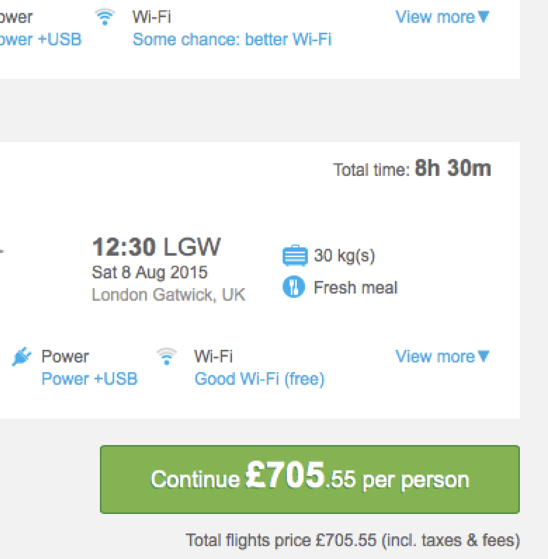 10Final testingDesktop and mobile journeys heavily tested.
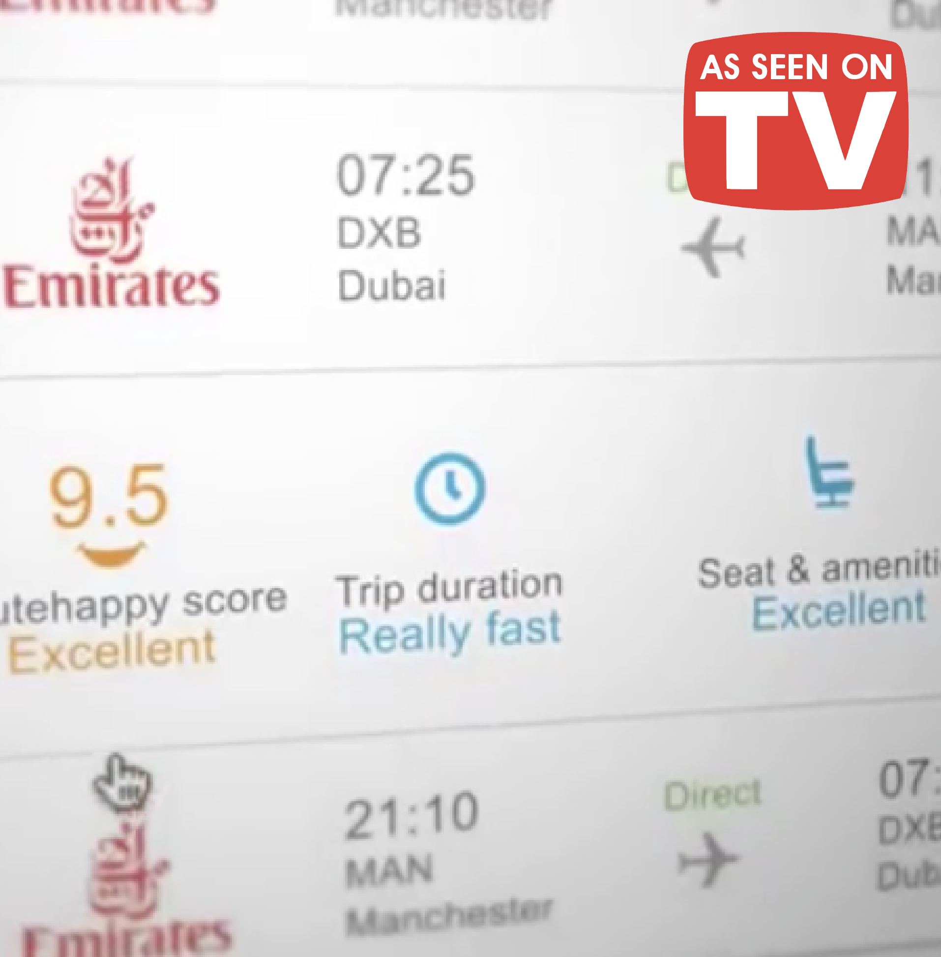 11Go liveCustomers can now choose the perfect flight.
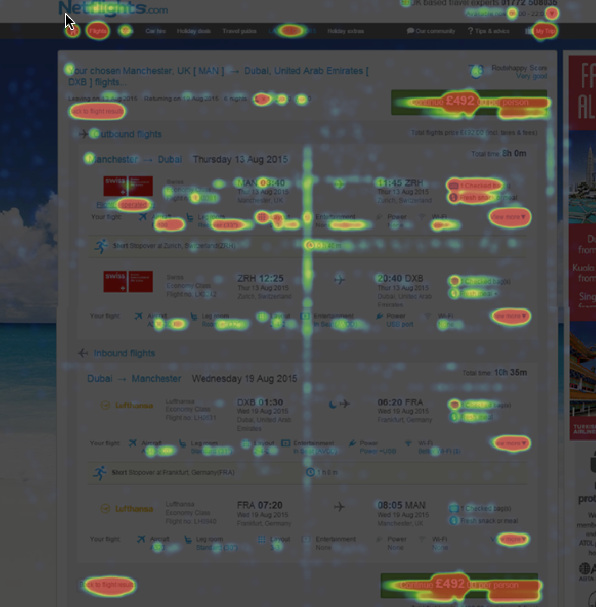 12OptimisePost-launch: design variations tested to see which converts more.
Showing customers more wasn’t automatically better. Showing them the right amount, at the right moment, was.
Proving it, then proving it again.
Launch wasn’t the finish line. Post-launch MVT testing found most of the remaining value.
Showing the fully expanded Flight Facts panel too early in the funnel was a distraction, so we tested a minimised version at the point customers were narrowing down a specific flight, then tested hiding individual elements to see which ones actually earned their place. The fully expanded view, kept for the moment a customer selected a specific flight, reinforced that they’d made the right choice.
Control vs. variant, test by test
The variant hid Flight Facts data entirely; showing it (control) converted 2.5% better
Test 2 vsThe variant next step conversion rate was 5.6% better than control
Test 3 vsThe minimised next step conversion rate was 18% better than control
Colour as the final lever.
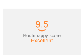
Before: every score defaulted to Routehappy’s orange, high or low.
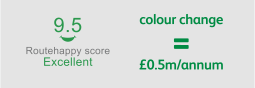
After: traffic-light colour, worth £0.5m a year on its own.
Routehappy’s own scores were branded orange by default, regardless of how a flight scored — a strong number could still look like a warning. We moved to a traffic-light system instead: green for a high score, amber for the middle, red for the low, so the colour matched what it meant at a glance.
The traffic-light colour treatment on the score was tested separately and increased conversion again, worth roughly £0.5m a year on its own — on top of the initial £1.2m from showing Routehappy content, and a further £0.7m from optimising the information architecture. Non-sales enquiry calls fell from 25% to 15% of total call volume, and the answer rate recovered to a consistent 94%.
From feature to brand campaign.
Flight Facts became the centrepiece of Netflights’ first TV campaign, and went on to win two industry awards.
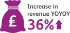
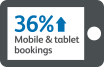
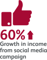
We believed in the idea enough, backed by the research, to build a full multi-channel brand campaign around it — social, email, paid, display, and a first-ever TV advert: “N is for Netflights.” The campaign helped deliver a 36% rise in mobile and tablet visits, a 30% rise in mobile and tablet bookings, and a 60% jump in click-through on retargeting email.
TV advert. “N is for Netflights.”
Feature story. The Flight Facts concept, explained.
Won on the strength of Flight Facts: a UK sector-first customer experience, built and proven through the process above.
Won for the same body of work, by which point Flight Facts had delivered £1.9m/year in measured incremental revenue.
What customers and the industry said.
Feedback gathered post-launch, from the people who used it and the partners who helped build it.
Customer feedback
“I liked how flight itineraries are ranked by ‘happy’ factor — taking into account different flight and connection times.”
“Good site. Quick to load. Easy to find what you are looking for.”
“Very helpful made booking flights easier.”
“Really easy to book, great choice of flight options.”
“The site is easy to navigate and provides clear information.”
Industry feedback
“The Netflights.com team impressed us with their commitment and creativity in integrating scores and amenities to benefit flyers as they shop for flights. Netflights.com is one of the leaders in the transformation of flight shopping from commoditised to differentiated.”
Robert Albert, Routehappy“Netflights.com consistently demonstrates best-in-class digital marketing. They use data to inform an understanding of the complex relationship between channels.”
Charles Reid, Director at Carat MediaCampaign metrics, at a glance.
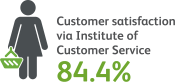
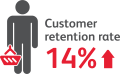
A recap of the “N is for Netflights” campaign in numbers — reach, engagement and the customer sentiment it drove.





See the same discipline applied elsewhere.