A consistent method for turning behavioural data into measurable gains.
How I built an evidence-led optimisation framework that transformed customer insight into continuous product improvements across multiple retail brands.
The approach, in short
Stakeholders proposed improvements every week, and none of the ideas were wrong, that was the problem: what was missing was a shared way to decide which ideas actually deserved investment before they got built. I built a repeatable loop instead: research produced evidence, evidence produced a hypothesis, hypotheses became prototypes, and prototypes became measured experiments whose results fed the next hypothesis.
The challenge was never a lack of ideas. It was confidence: a repeatable way to know which ideas deserved investment.

My role, in short
I built and ran this evidence-led optimisation framework personally, with agency support brought in for deeper technical and research capacity along the way. Tap a tile for the fuller picture.
What I worked on
The Framework
Owned the entire loop personally across multiple retail brands, not just individual test execution.
Research Methods
Moderated usability labs, guerrilla research, customer interviews and in-store observation, alongside behavioural analytics, funnel analysis and A/B and multivariate testing — analytics showed where people left, only a lab session showed why.
The Research Hub
A living record of what had been tried and learned, archived deliberately — including failed tests — so every decision after it got faster and better informed.
Cross-Channel Thinking
A change to a mobile product page was expected to show up in a call centre’s numbers and a store’s footfall too, not just a funnel report.
The team
Programme LeadMark Jones
Owned the framework, the research hub and the cross-channel thinking personally; brought in support where deeper technical or research capacity was needed.
Front-End Developers
Built the simpler tests myself; brought developers in for the ones that needed more technical depth than a no-code testing tool could handle.
Data Scientists
Access through the same agency support, used to strengthen the evidence base behind a hypothesis before committing to a build.
User Research Interviewers
Kept me close to every session without being the one asking every question, so I could focus on where the conversation needed to go next.
Synthesis Support
Turned raw evidence into decisions as a shared exercise, not something worked out alone at a desk.
Impact, in short
Over six years the framework produced 120 documented research and optimisation initiatives and 42+ named, individually coded experiments with disclosed results, not selectively reported wins. The Harveys Swatch Selector delivered +13.2% conversion and +69.2% interaction at an 84.2% chance of beating control, predicted to return £388,467 over six months; the Finance Calculator drove +30.4% conversion, +31% transactions and +14.1% more finance applications; and Shop by Type reached double the site’s average conversion rate while generating 14.53% of site revenue in the period. Because every result fed the next hypothesis, these weren’t isolated wins but a compounding, repeatable method for deciding what to build next.
Contributions
Built and run personally, with agency support brought in where deeper technical or research capacity was needed. Here’s the honest breakdown — tap a tile for the fuller picture.
What I worked on
The Framework
Owned the entire loop personally across multiple retail brands, not just individual test execution.
Research Methods
Moderated usability labs, guerrilla research, customer interviews and in-store observation, alongside behavioural analytics, funnel analysis and A/B and multivariate testing — analytics showed where people left, only a lab session showed why.
The Research Hub
A living record of what had been tried and learned, archived deliberately — including failed tests — so every decision after it got faster and better informed.
Cross-Channel Thinking
A change to a mobile product page was expected to show up in a call centre’s numbers and a store’s footfall too, not just a funnel report.
The team
Programme LeadMark Jones
Owned the framework, the research hub and the cross-channel thinking personally; brought in support where deeper technical or research capacity was needed.
Front-End Developers
Built the simpler tests myself; brought developers in for the ones that needed more technical depth than a no-code testing tool could handle.
Data Scientists
Access through the same agency support, used to strengthen the evidence base behind a hypothesis before committing to a build.
User Research Interviewers
Kept me close to every session without being the one asking every question, so I could focus on where the conversation needed to go next.
Synthesis Support
Turned raw evidence into decisions as a shared exercise, not something worked out alone at a desk.
The problem was never a shortage of ideas.
Stakeholders proposed improvements every week. Product wanted one thing. Marketing wanted another. Merchandising had its own list. None of them were wrong. That was the problem. Every idea sounded reasonable in a meeting.
What didn’t exist was a shared way to answer five questions before any of them got built: Which problems actually matter? Which ideas deserve investment? Which opportunities are commercially worthwhile? Which changes should be prioritised? Which assumptions still need validating?
Without that, prioritisation became a negotiation, not a decision.
The challenge was never a lack of ideas. It was confidence: a repeatable way to know which ideas deserved investment.
Evidence artefact: the hypothesis backlog. A dense, unordered queue of competing proposals, before a shared framework existed to arbitrate between them.
One loop, run continuously.
Research produced evidence. Evidence produced a hypothesis. Hypotheses became prototypes. Prototypes became experiments. Experiments produced new evidence, which fed the next hypothesis.
The individual experiment was never the point. The loop was.
Not every idea earned the same amount of evidence before it shipped. Some were resolved quickly, fixed and released, no formal test required. Others carried real uncertainty, and those went through the full loop: research, prototype, test, result. The judgement was knowing which was which.
Not every idea needed the same weight of evidence. Quick fixes and tested hypotheses were treated as two different categories from the start.
What the loop actually looked like, once.
The next five beats are one real project, the Harveys Swatch Selector, and they map exactly onto the loop above.
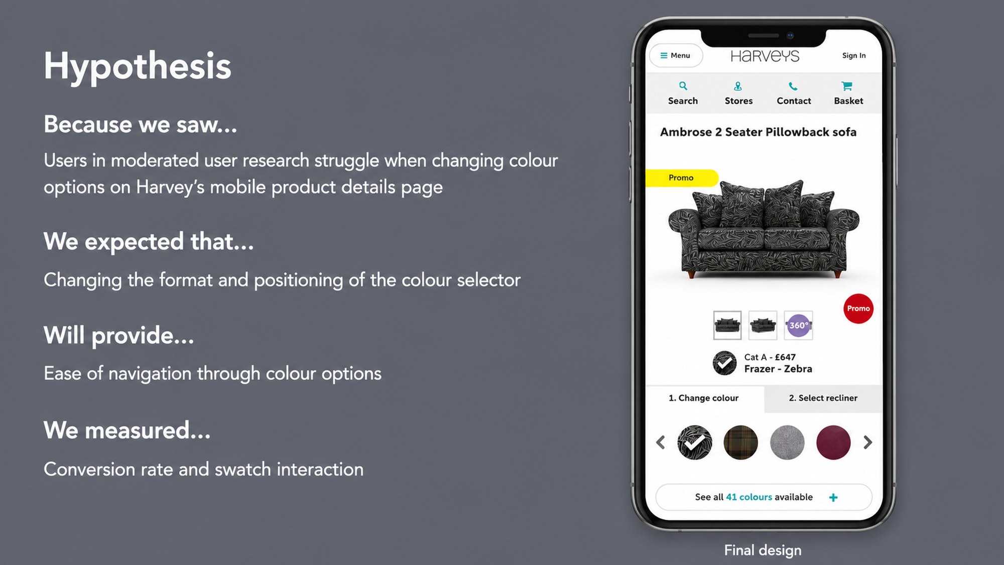
The plan, stated before anything was built.
Because we saw users in moderated research struggle to change colour options on Harveys’ mobile product page, we expected repositioning the selector would improve ease of navigation. We measured this using conversion rate and swatch interaction, named before the test ran, not chosen afterward to flatter the result.
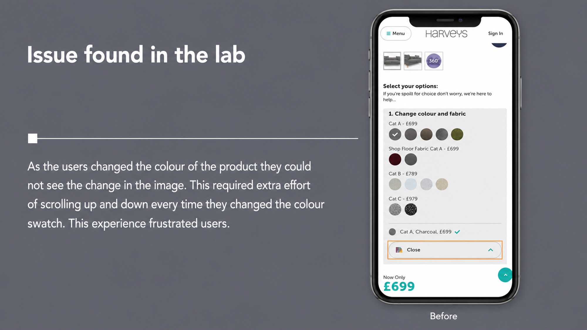
The problem, found in the lab.
Colour swatches sat below the product image, in a separate scrollable panel. Changing colour didn’t visibly update the image without scrolling. Users scrolled up to check it had worked, then back down to keep choosing. Small friction, repeated constantly, on the page carrying the most commercial weight on the site.
Solved cheaply, before it got expensive.
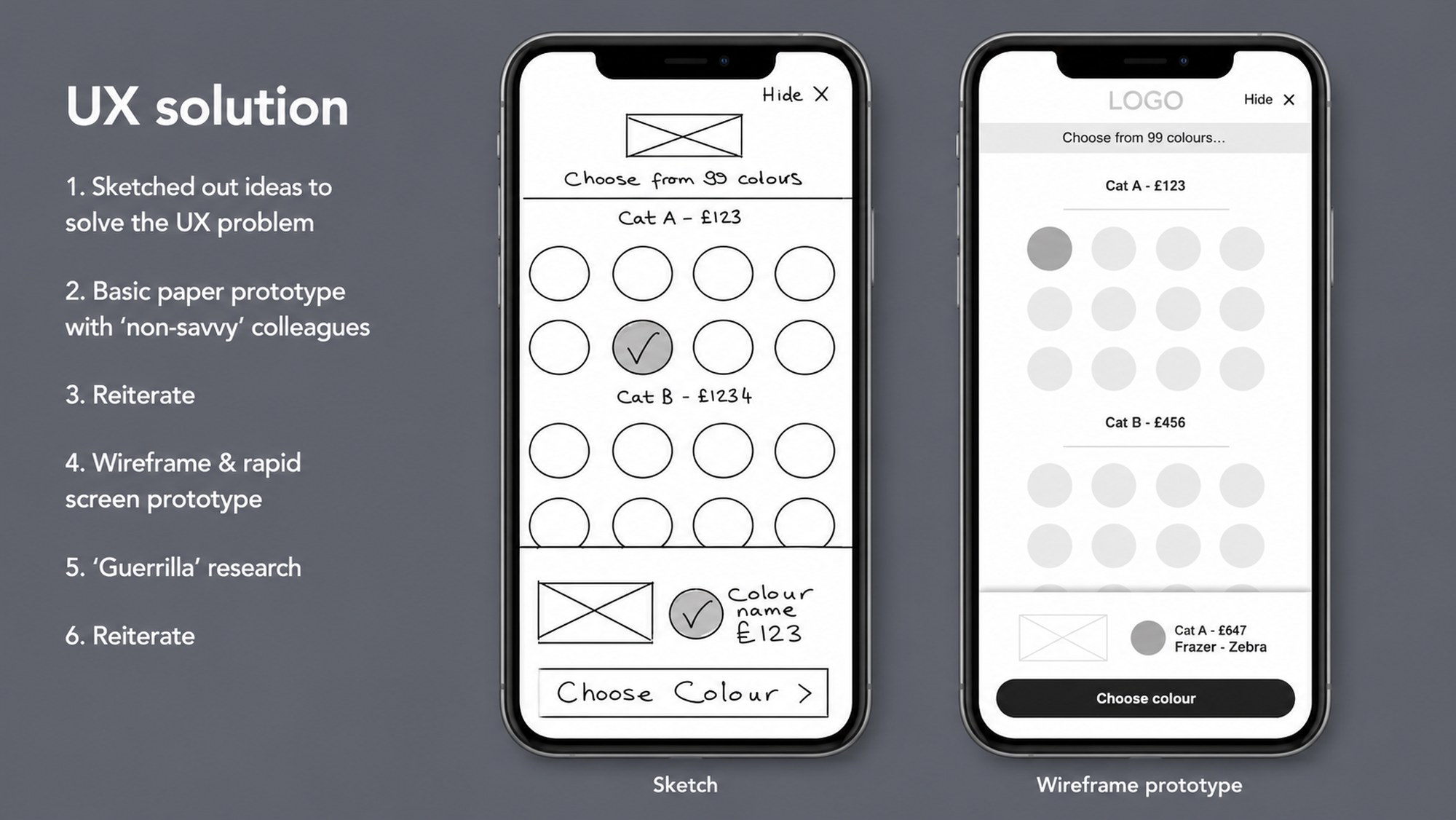
A sketch, tested against paper with colleagues who weren’t designers. Then a wireframe, carrying the same structure into a rapid screen prototype. Each stage cost almost nothing and ruled out the ideas that wouldn’t have survived contact with a real customer.
Only once the direction was confident.
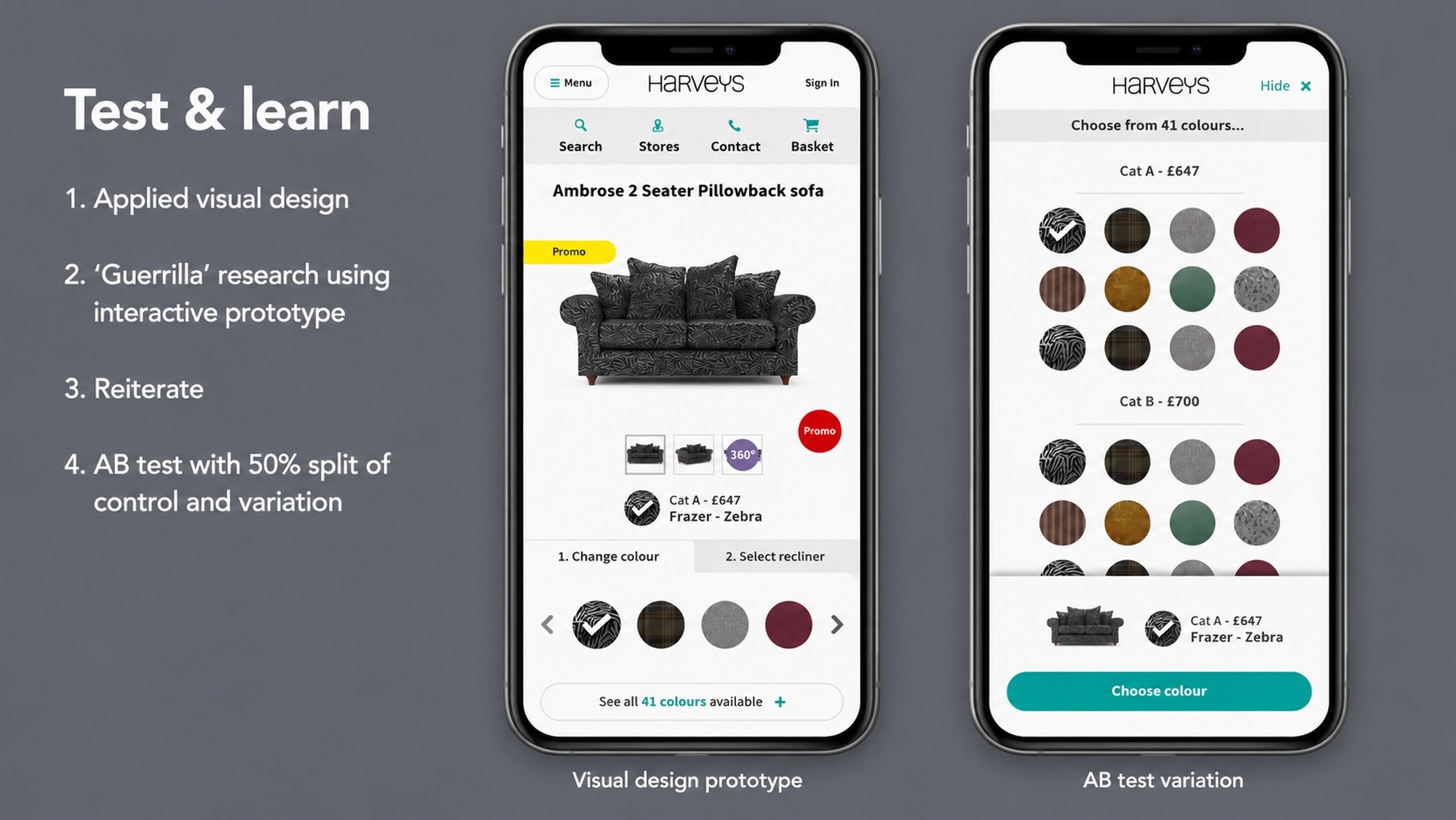
Full visual design, validated once more through guerrilla research on a working prototype, before a single line of production code. Only then, a formal A/B test: a 50/50 traffic split between the redesigned control and a bolder variation, run against real customers.
Reported at its real, honest value.
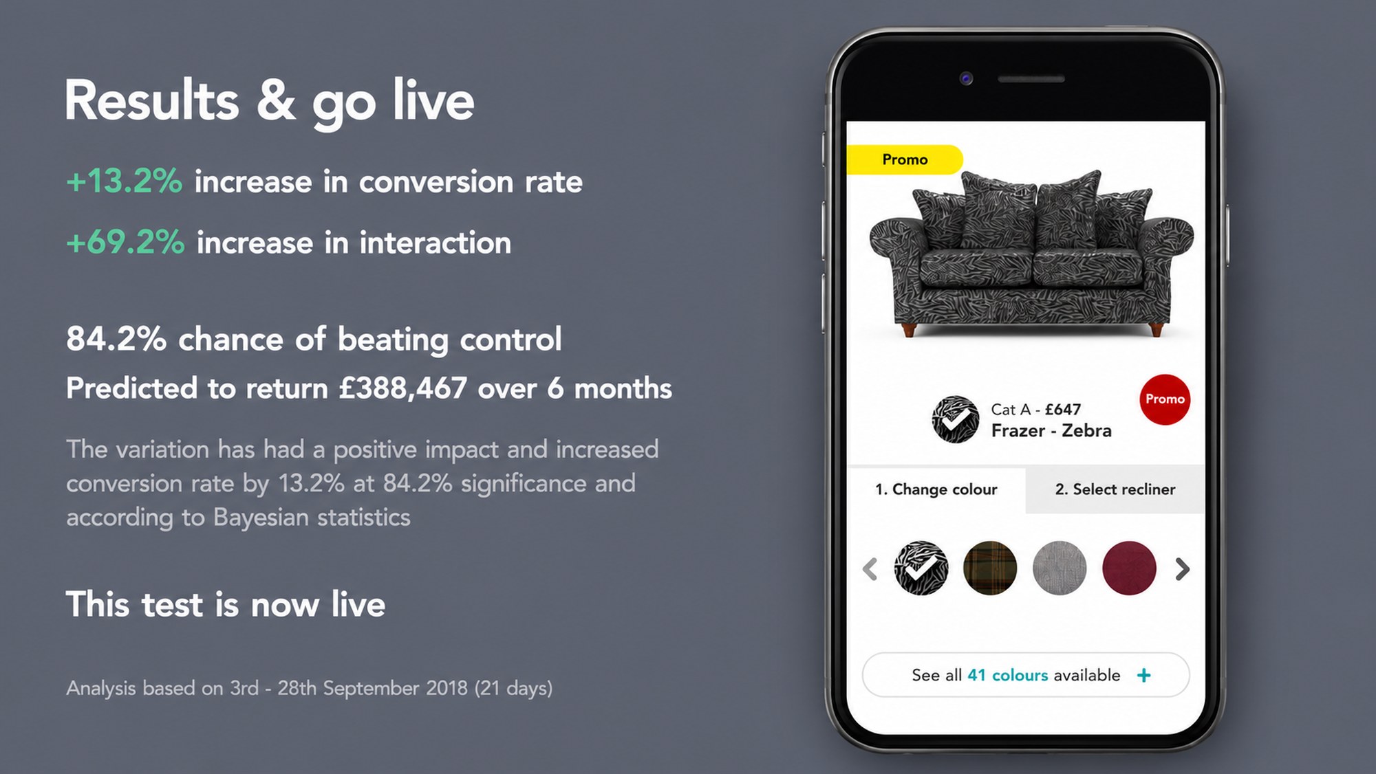
+13.2% increase in conversion rate. +69.2% increase in interaction. An 84.2% probability of beating control, calculated using Bayesian statistics and reported without rounding up. Predicted return: £388,467 over six months.
The test didn’t find the problem. A person, watching another person’s hands hesitate, found the problem. The test told us what it was worth.
The learning didn’t come from the test. It came from watching someone scroll.
Not once. Repeatedly.
The Swatch Selector wasn’t a special case. It was the same loop, run against a different problem, across six years and two brands.
Finance Calculator
- Problem
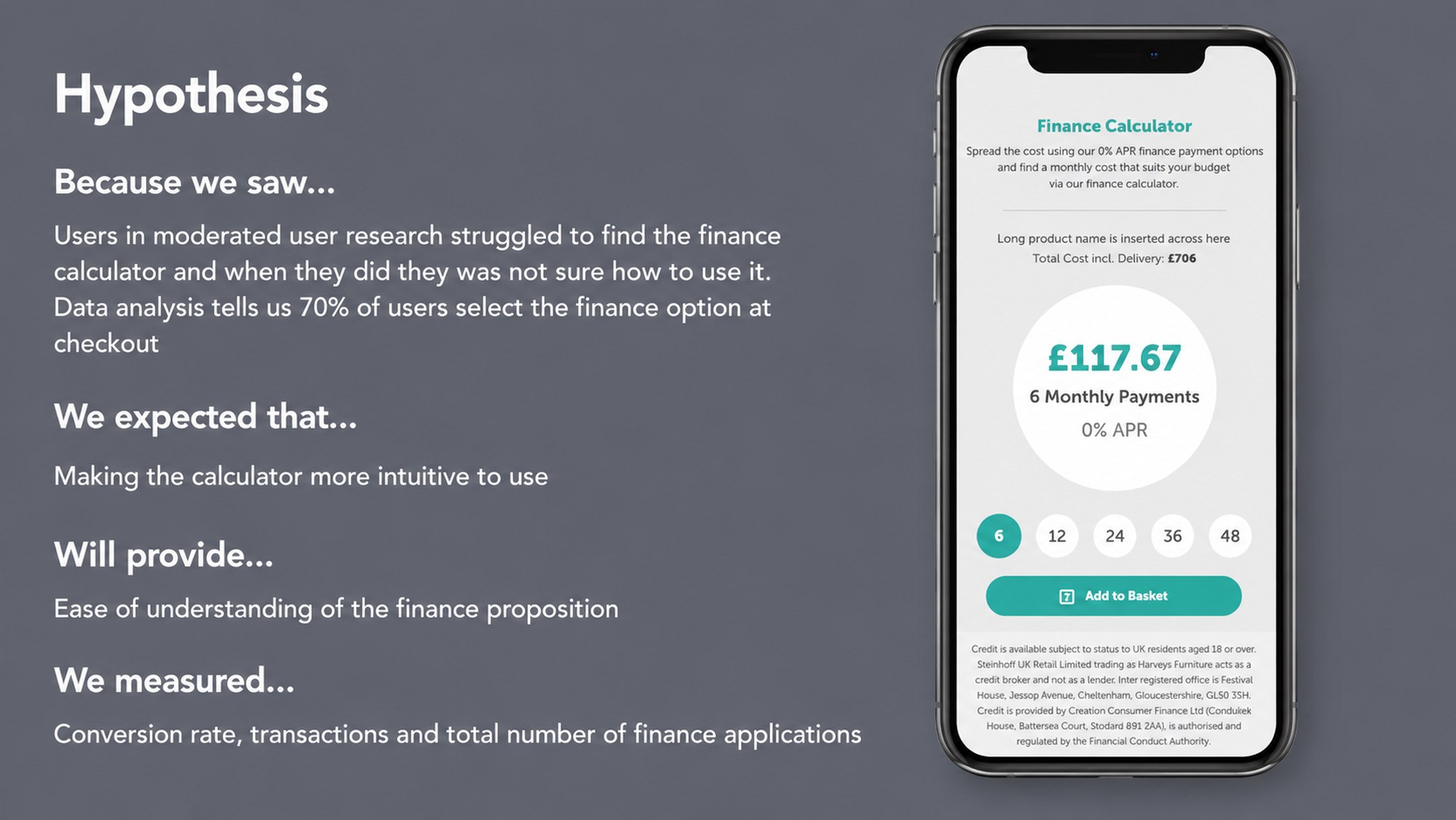
- Users struggled to understand and use the finance calculator on mobile product pages.
- Evidence
- Moderated research flagged confusion at a specific interaction point on the mobile PDP.
- Approach
- Reformatted the calculator; measured against three metrics, not one: Add-to-Basket rate, conversion rate and finance application rate.
- Outcome
- +30.4% conversion rate, +31% increase in transactions and +14.1% increase in number of finance applications
- Learning
- Measuring three outcomes instead of one prevented a narrow win from masking a broader problem.
Checkout Optimisation
- Problem
- The checkout funnel lost 18% of all traffic at Payment Details, worse on mobile (22%) than desktop (13%).
- Evidence
- The three payment methods behaved nothing alike: 67% of users chose Finance, but PayPal, chosen by only 6%, had the highest drop-off at 42%.
- Approach
- The funnel numbers were only one input. Heuristic evaluation, competitor benchmarking, session recordings and service blueprinting were triangulated before validating improvements through a 2017–18 programme of labs and A/B tests.
- Outcome
- +27% checkout conversion, measured over a four-week A/B test ahead of full rollout.
- Learning
- Analytics highlighted the symptoms. Research uncovered the causes. The checkout wasn’t one problem: it was three different journeys wearing one name.
Search & Navigation
- Problem
- Customers relied on search constantly, but it sat visually hidden in the header, friction for the people with the clearest purchase intent.
- Evidence
- Exposing it lifted sessions with search and progression to PDP, but also reduced use of the store finder and softened conversion among searchers, a sign the variation reached lower-intent users too, not just more of the same ones.
- Approach
- No new feature, no copy change: the search bar itself was untouched. Made visible, then measured across the full funnel, not just search usage in isolation.
- Outcome
- +54% uplift in sessions with search · +51% uplift in progression to PDP
- Learning
- The biggest single number in the whole programme came from making an existing tool visible, not building a new one, though it changed who used it, not just how many.
SleepPRO Kiosk
- Problem
- The supplier-built kiosk had too many steps and little signposting: in-store testing showed customers couldn’t navigate it unassisted.
- Evidence
- Moderated in-store sessions with real customers surfaced exactly where people got stuck, screen by screen.
- Approach
- Sketched a simpler flow, built a rapid screen prototype, tested it with colleagues who’d never seen it before, reiterated.
- Outcome
- +25% store conversion · +60% customer usage
- Learning
- A supplier’s default interface isn’t a fixed constraint. It’s just another UI, and it responds to the same process as anything built in-house.
Shop by Type
- Problem
- Users couldn’t quickly find products that matched their key needs.
- Evidence
- Research and behavioural data both pointed to the same friction: people struggled to get from the homepage to the right product category.
- Approach
- Added ‘Shop by type’ quick-link buttons to the home page, linking straight into the right product category.
- Outcome
- Combined conversion rate of 0.45%, double the site average of 0.22%, generating 14.53% of site revenue in the period (£103,657 of £713,240)
- Learning
- Although fewer users now use the main navigation for most products, more are reaching the product they want, faster, via Shop by Type.
None of it ran on instinct.
Every hypothesis in this programme started as evidence, not opinion. Moderated usability labs, guerrilla research, customer interviews, in-store observation, surveys. Behavioural analytics, funnel analysis, exit analysis, device segmentation, A/B and multivariate testing.
Neither alone was enough. Analytics could tell you where people left. Only a lab session could tell you why.
Real respondent behaviour, not a designer’s summary of it: the payment-method split that shaped the checkout redesign.
Every stage of the journey fed the same loop, and every loop fed the archive below.
Five customer-journey stages, one shared research track, one evidence loop, and a six-year archive that made every result sharper than the last.
↻Remind & Update re-engages the next arrival — the journey is a loop, not a line.
↻Every result reopens the loop as the next hypothesis — fading in, from evidence, at full strength.
Results ship back as live enhancements to the journey, and archive into the knowledge hub above, which compounds into every future hypothesis. This is the single mechanism the whole programme ran on, applied to a different problem, every time, for six years.
Act V: What Compounds
Every experiment became something the next one could use.
A test that failed wasn’t deleted. It was archived, separately, deliberately: its own category, not folded into the wins. Over six years, that discipline built something larger than any individual page redesign: a living record of what had already been tried, what had already been learned, and what was still worth asking.
The programme didn’t just improve the product. It got faster at improving the product, year over year, because less of it had to be rediscovered.
The evidence didn’t just prove individual decisions. It made every decision after it faster and better informed.
120 cards · 13 lists · 177 attachments. Including a dedicated, standing archive of losing and inconclusive tests: kept, not discarded.
The work that never touched a screen.
The KPI taxonomy behind this programme didn’t stop at the website. Alongside online conversion, every initiative was tagged against telesales support and store footfall, evidence that the thinking here was never scoped to a browser window. A change to a mobile PDP was expected to show up in a call centre’s numbers and a store’s footfall, not just a funnel report.
The research hub itself is a leadership artefact, not just a research archive. Choosing to build shared, structured, searchable organisational memory (rather than letting six years of research live in inboxes and forgotten decks) is itself a decision only someone thinking beyond their own deliverables makes.
What the business went on to report. Through 2021 Bensons for Beds reported double-digit like-for-like growth online as part of the omnichannel transformation its board described, on the ecommerce platform we had migrated to from Magento during the pandemic while the business kept trading. The Christmas after I left, online sales on that platform rose 41% year on year. Those are the company’s numbers, with many hands behind them; the method on this page is the part I can claim.
Sources: Retail Gazette, August 2021; Furniture News, January 2022; Internet Retailing, January 2023.
Reflection
What actually compounded.
The biggest lesson wasn’t that one experiment improved conversion. It was that evidence-led decision-making compounds: each result making the next hypothesis sharper, each failure archived rather than repeated.
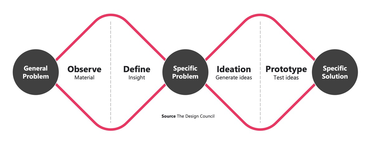
Research, prototyping, and experimentation were never separate disciplines here. They were the same instrument, used at different speeds: a sketch reduces uncertainty for the cost of an afternoon; a guerrilla test, for the cost of a day; an A/B test, for the cost of a build.
By building a repeatable framework, optimisation stopped being a sequence of projects and became an organisational capability. That’s still true of how I work now.
See the same discipline applied to a longer, higher-stakes discovery programme.